Guide to Using the Interactive Map
As part of our series of visualizations, we created an interactive map that any reader can manipulate on their own by checking and unchecking the boxes on the bottom half of the page. When using the map, please keep the following in mind:
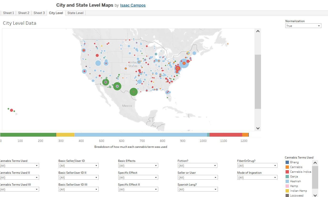
1. As I’ve explained elsewhere on this site, the Chronicling America newspaper collection on which we based our work, is geographically uneven. For some states, there were upwards of 16,000 available newspaper issues for the years we studied. For others, there were only a few hundred. To account for this discrepancy, we created a “normalization” toggle on all the geographic visualizations, including the map (see #2 below on how to activate the toggle when using the map) so that you can view the raw numbers or view the proportion of total issues available that fulfills whatever criteria we are measuring. Thus, for example, there were only 2 articles from Maine that used the word “hashish” as a primary term for cannabis. However, Maine is also relatively underrepresented in the total corpus, with only 1,103 total issues for the period under study in comparison to, say, Texas, that had 15,333. Thus while Texas had more articles in the corpus (12) using “hashish” as a primary term for cannabis, this was a smaller percentage of the total issues available for Texas in comparison to the same numbers for Maine. Thus if you look at a visualization utilizing the raw numbers, Texas’s share is obviously larger, but, when normalized, Maine’s share looks larger than Texas’ because just under .2% (.0018) of the total issues from Maine fit this criteria whereas fewer than .08 % (.00078) of the issues from Texas did.
2. Notice that at the top of the map there are five tabs that read: “Sheet 1,” “Sheet 2,” “Sheet 3,” “City Level,” “State Level.” You can mostly ignore the “Sheets” which are basically draft versions of the final maps displayed under “City Level” and “State Level.” The one exception is if you want to utilize the “Normalization” toggle. For whatever reason, we could not get the toggle to work on the “City Level” and “State Level” versions of the map. However, if you click on either “Sheet 1” or “Sheet 2,” you can toggle between “true” and “false” for the “normalization” and this will translate to the “City Level” and “State Level” versions of the map that you are working on.
3. You can click on multiple boxes at once to combine criteria. For example, you can click on “Marihuana” as your primary term, “Negative” for your “Basic Effects,” and “Madness” for the specific effect and see where articles appeared that fit that criteria. However, not every single combination of checked boxes will provide a visualization. For example, if you check “hashish” for the primary cannabis term, and then “hashish” for the secondary term, you will get no visualization at all because such a combination is impossible (if it was the first term, it can’t also be the second). Similarly, if you search for a combination of primary, secondary, and tertiary terms that never appeared in the data, then you will also get a blank page.
4. The size of the dots on the map are not static from visualization to visualization. Instead they are relative to the data for the other cities and states for that particular visualization. Thus, for example, there were just 12 articles in Texas that used the term “hashish” as a primary term for cannabis, while there were nearly twelve times as many (139) that used the word “marihuana.” But if you manipulate the map to view only the hashish stories, and then, in a separate visualization, do the same for marihuana stories alone, the marihuana dot in Texas is not twelve times larger than the hashish dot on the other visualization. Again, the dots are in proportion to the results of the other cities and states within each visualization, not between them.